Object Professionalism
A series of projects on the "pro-ness" of objects, in this user-friendly world.
#CriticalDesign #DesignResearch
Aug 2019 — May 2020 / MFA Design thesis / California College of the Arts
Advisors: Brett MacFadden, Stuart Kendall, Sara Dean
Exhibition
CCA Class of 2020 Showcase, May 2020, online
Recognition
Class of 2020 Showcase Curator’s Pick Award
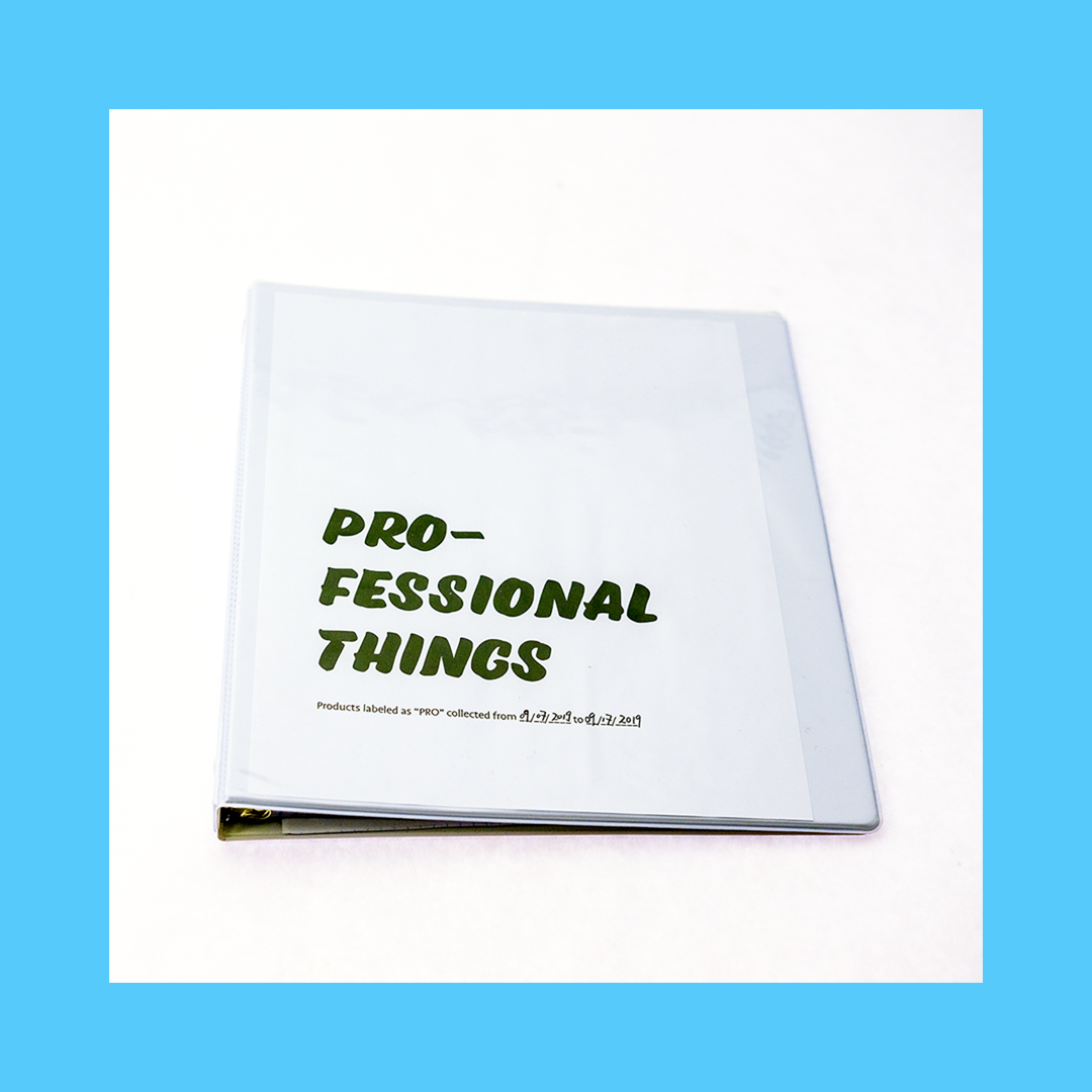
I started looking for "pro-ness" by collecting products labeled with "pro," and ended up with this binder of tools. Regardless of the marketing cover-up, apparently, things have coopted the “pro” titles and become the "knower" in every aspect of our lives.
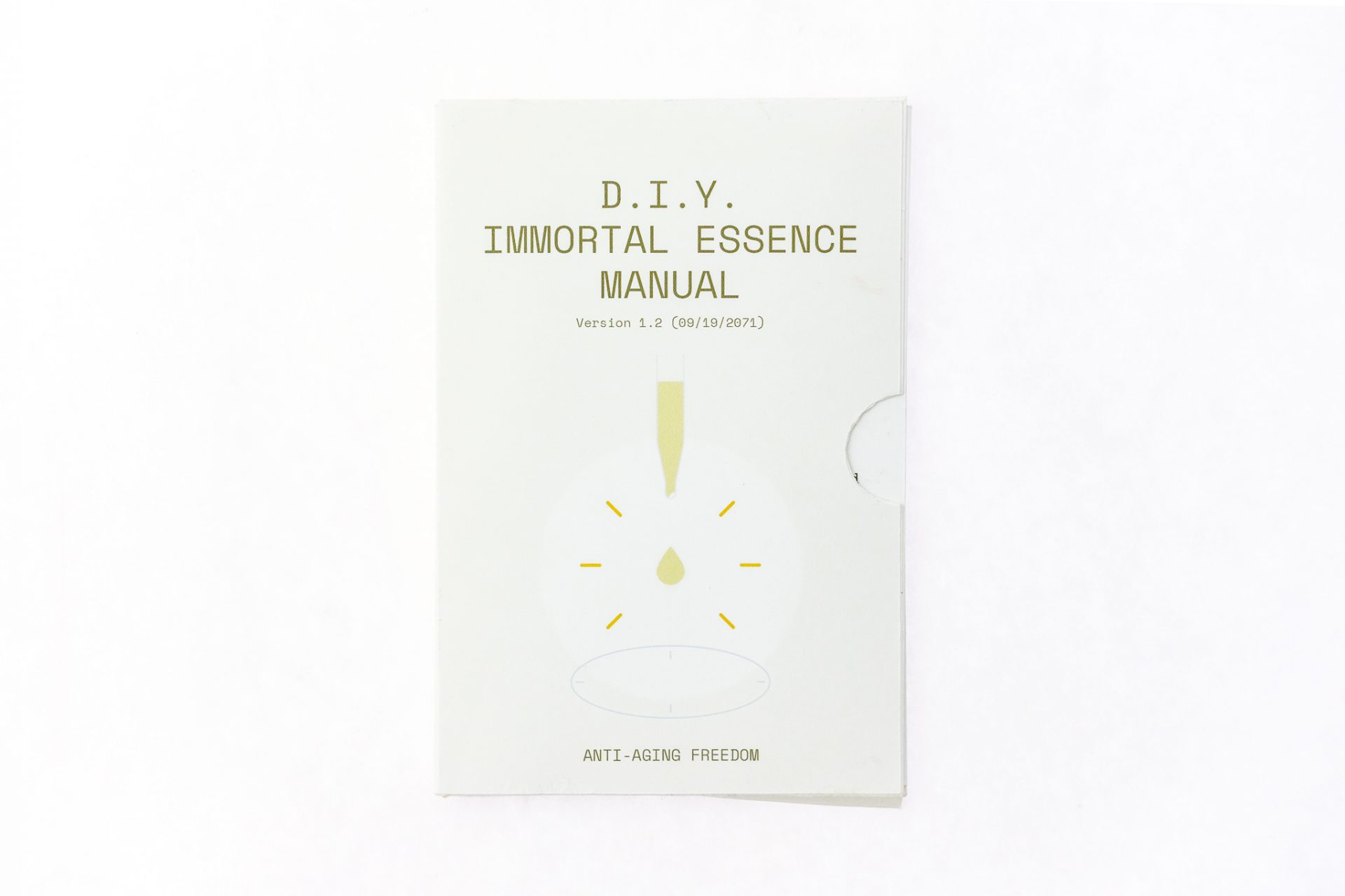
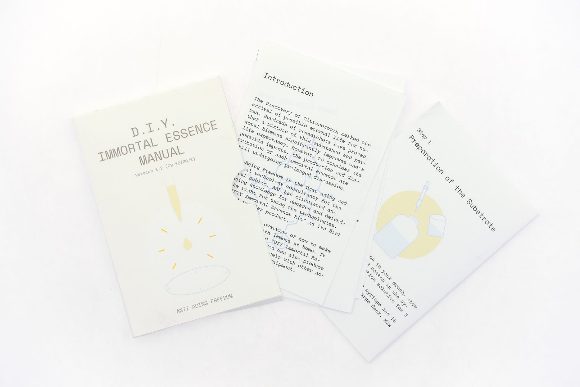
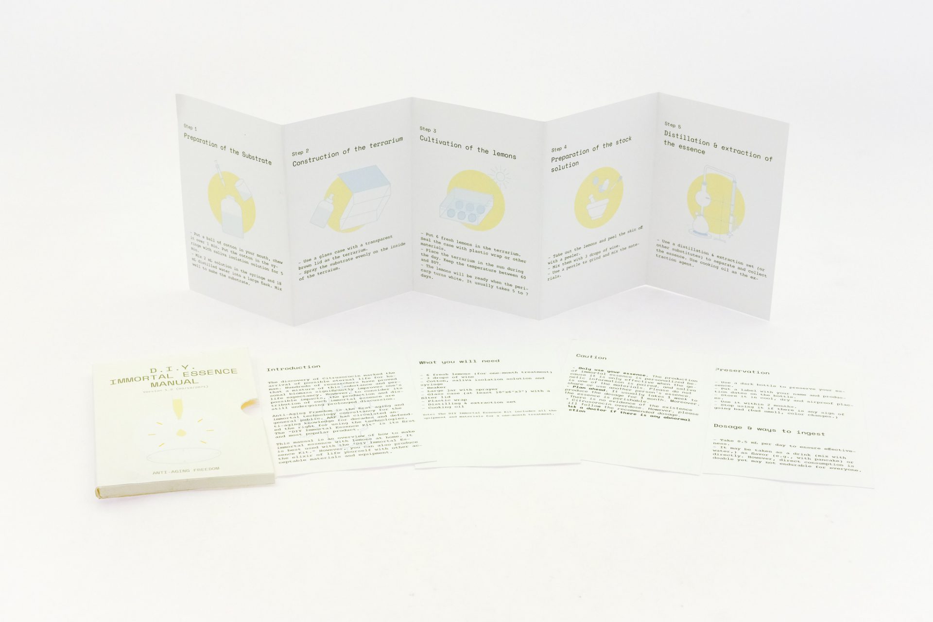
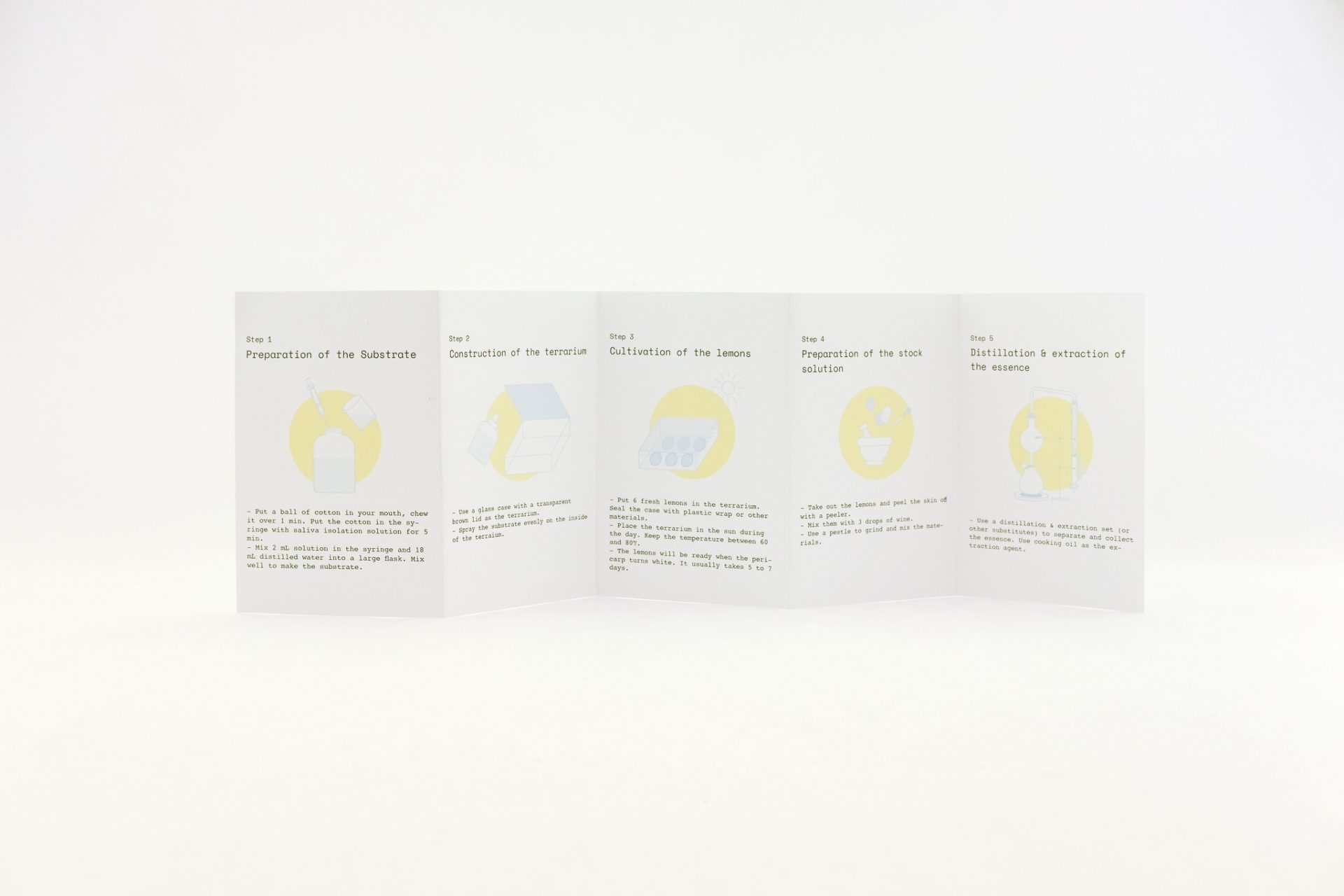
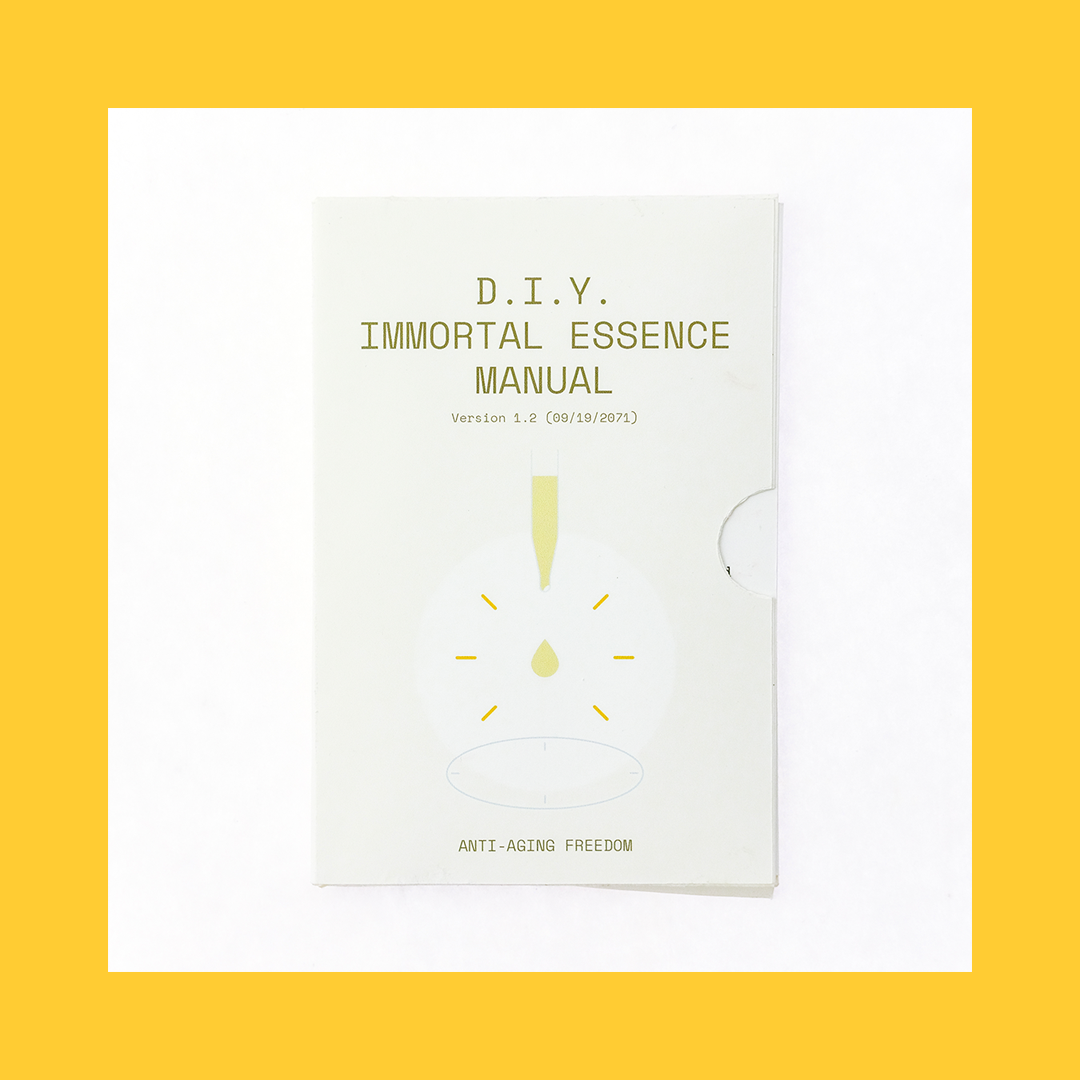
I also tried mimicking the “pro” quality in hardcore DIY projects by re-creating their high-tech, democratic, and unreliable images. The D.I.Y. Immortal Essence Manual claims to satisfy a long-standing desire while situating itself in a speculative setting where lemon is the cure.

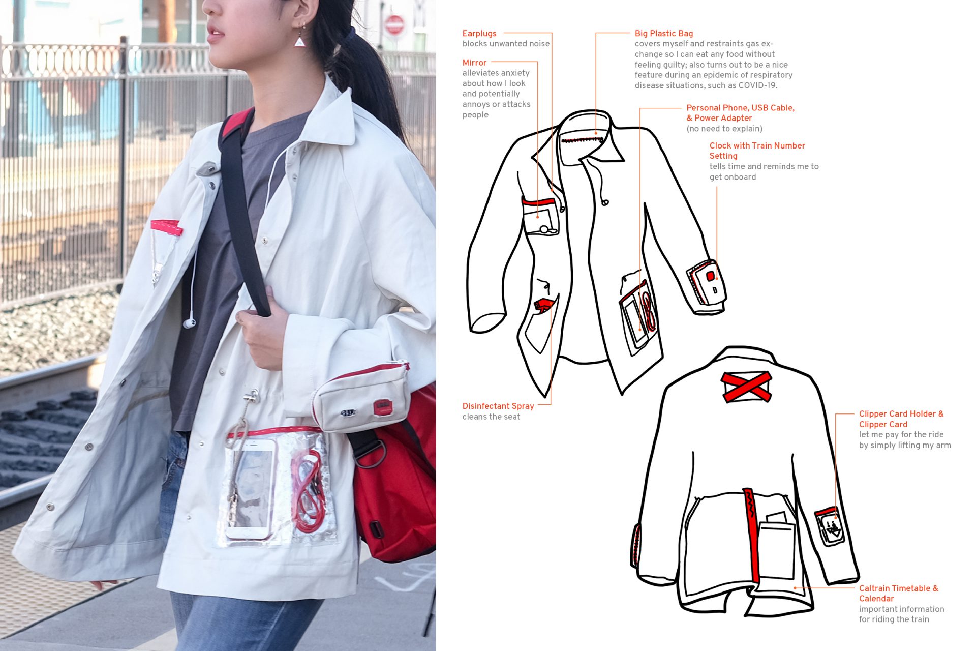
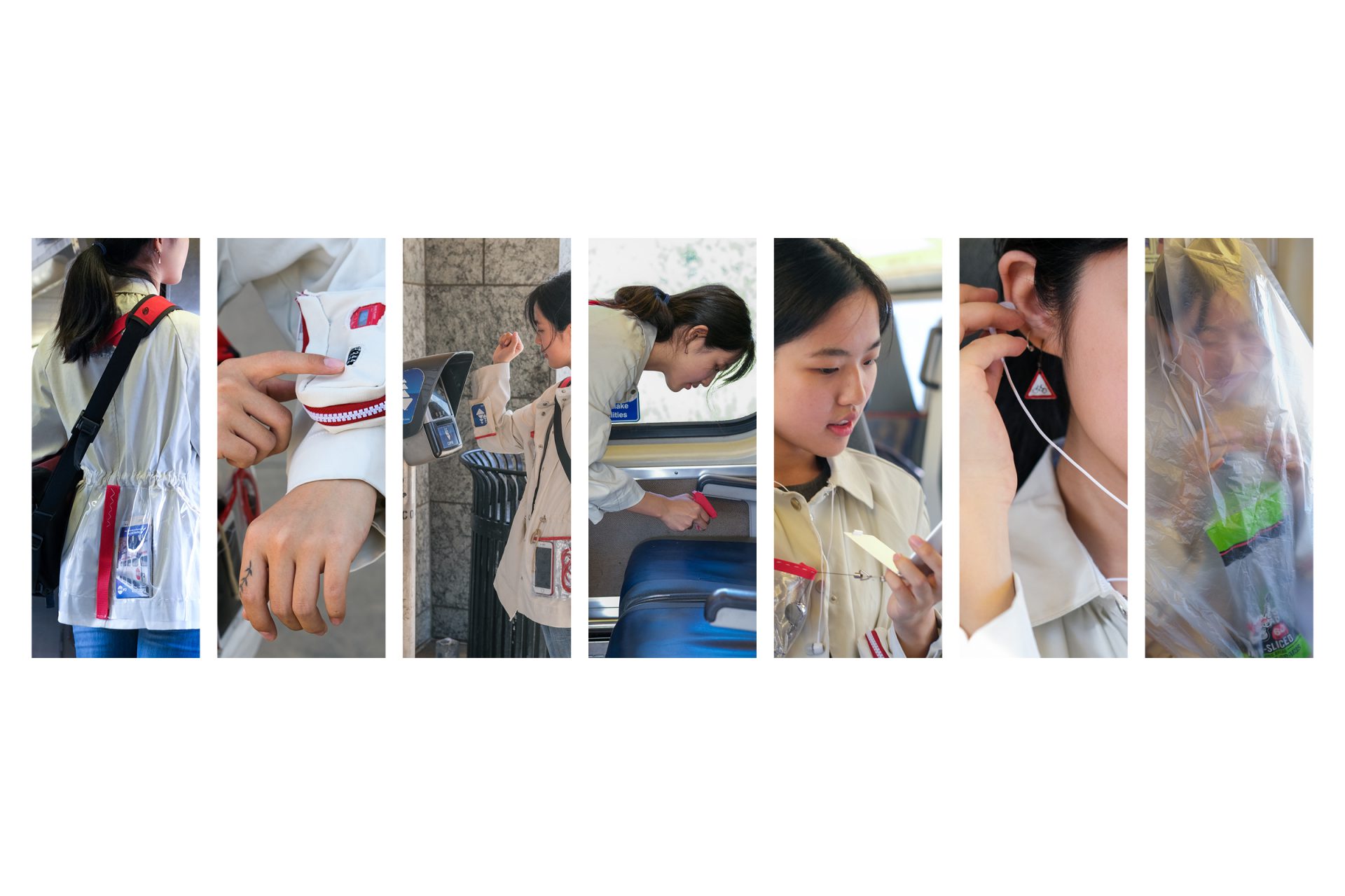
This Caltrain Commuter Jacket has multiple removable parts that meet Caltrain riders' different needs. It is a demonstration of my ideal professional thing. It is an understandable bundle of tools—you have it, master it, and subtract the features you don’t need.
It is the opposite of common multi-func PRO tools. Think about a design software or a DSLR. There are so many entry points and so few constraints that novice users are easy to be lost and ended up confined to the limited features they are familiar with.
Each feature is made possible by a removable module. The user will only keep the ones they need when they are familiar with every part. It's a coevolution between a user and a tool.

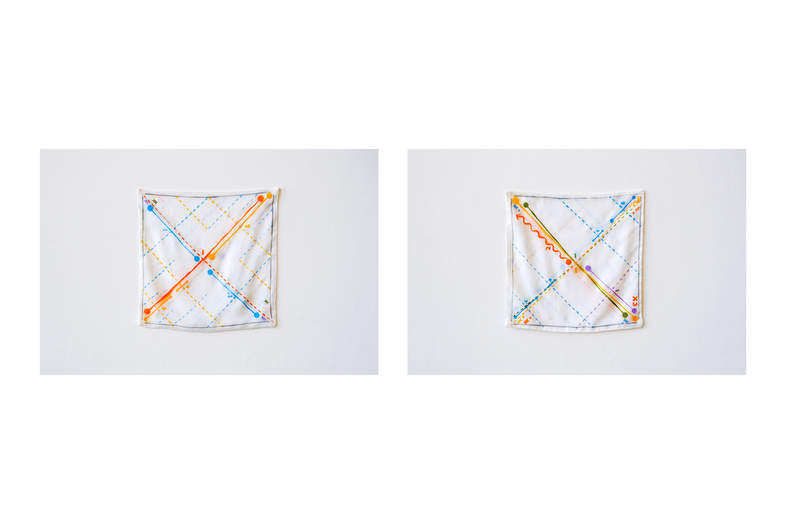
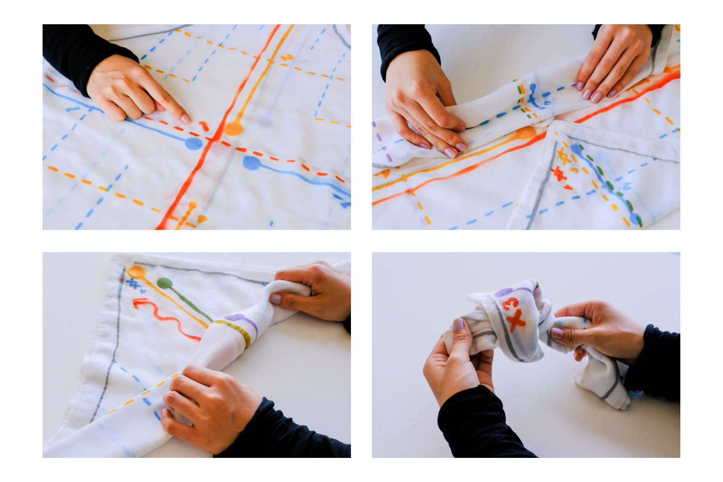
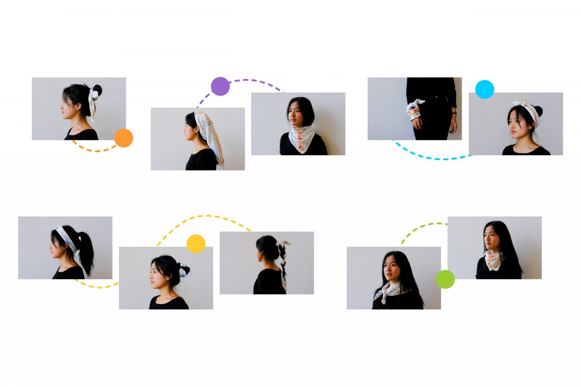
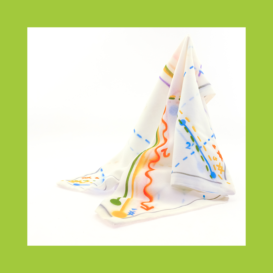
Connect the Dot Bandana is a 22"x22" scarf with instructions in five different colors, each represents a way of folding and knotting. It is a result of my attempt to make a professional object which has as much embedded knowledge as it can.
Nevertheless, however much knowledge the fabrics has, there’s always a human part. There should be affordance and agreed rules of communication between the tool and the user so it is usable. Experience, creativity, and care are also needed to do it well.
HOW TO USE IT
- Choose a color, follow the order (starting from "1")
- Fold along the dashed lines, connect the dots
- Make a knot at the cross / two knots at a double cross
- Put it on, wrap it around your head, neck, wrist, handbag, etc.
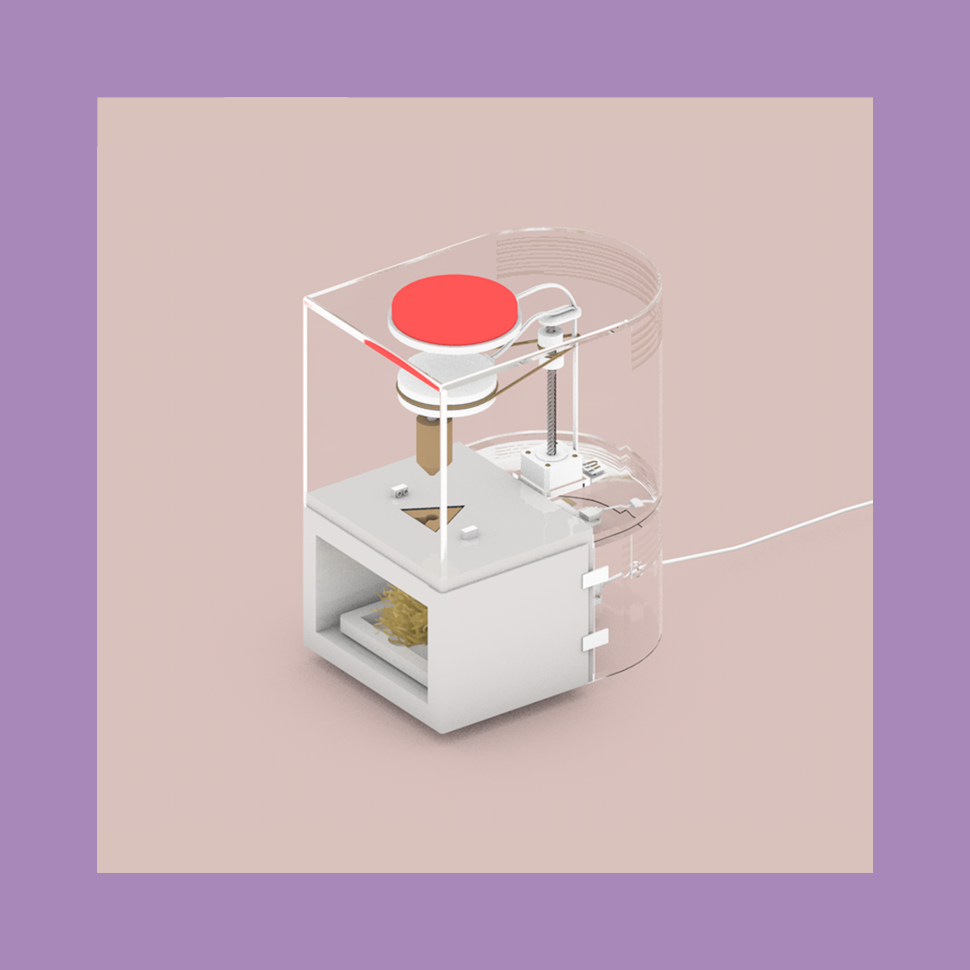
Finally, I speculated this fire-starter—a hybrid of modern home appliance and primitive friction fire technology—to finish my thesis with a criqique on contemporary design.
It is a metaphor of user-friendly tools we have today. Loaded with embedded knowledge and varnished with smooth shells, they invite us to use but not think.
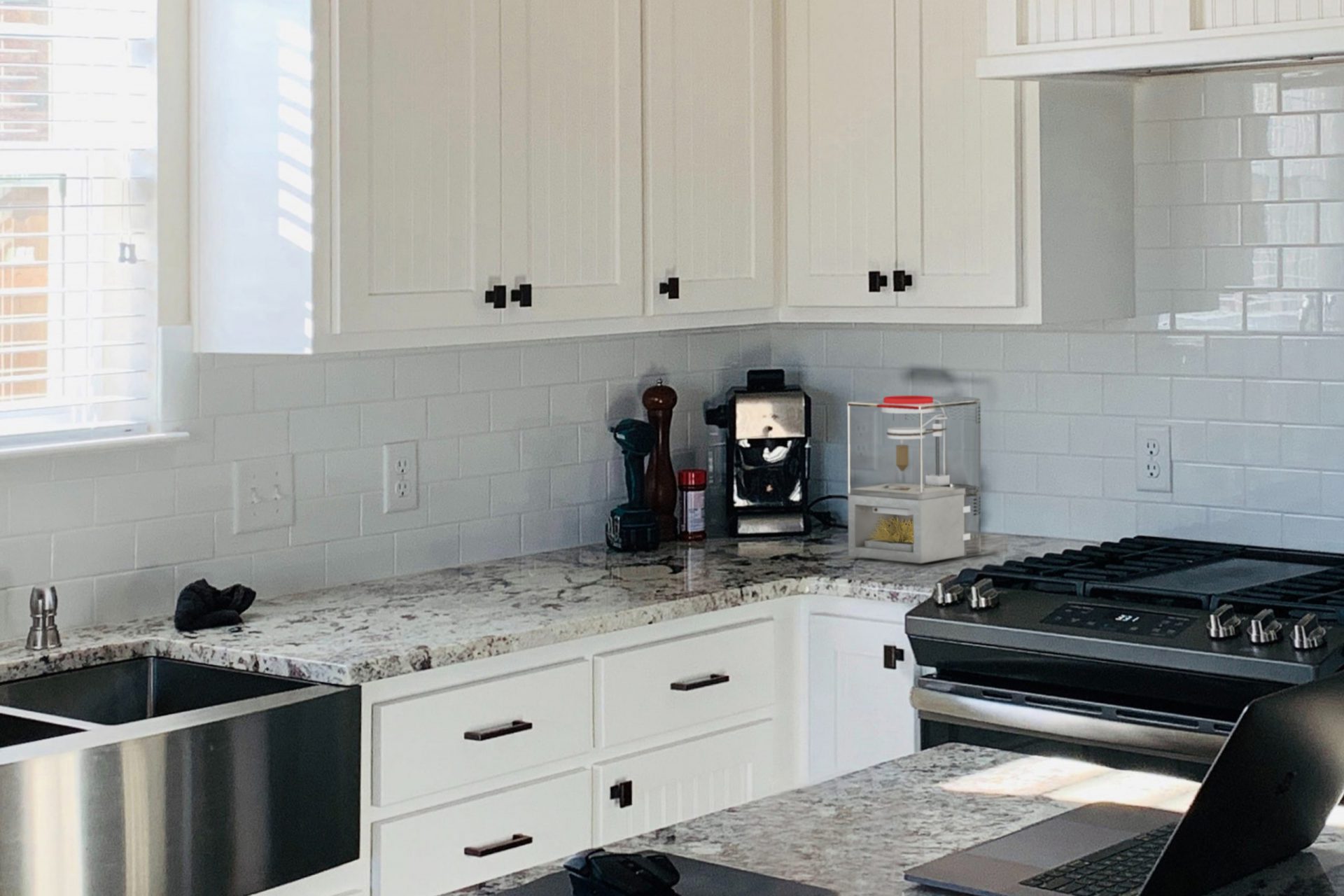
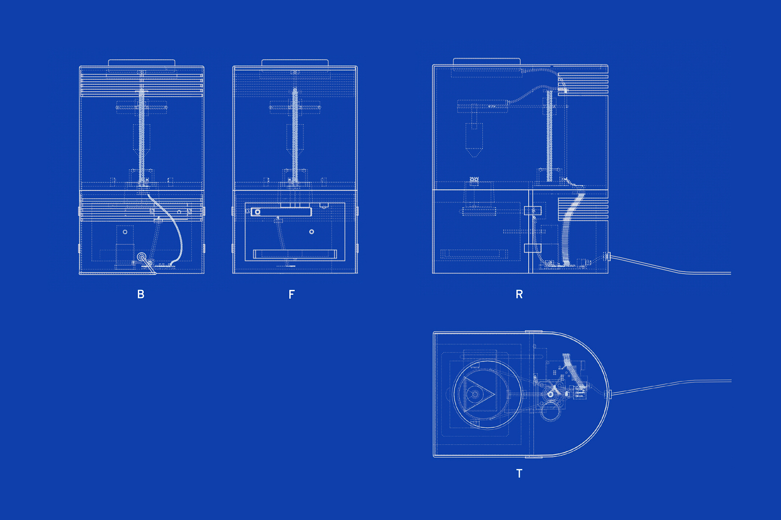
The conceptual machine has three parts:
- top: motors and a drill,
- bottom: a stove, and
- lower back: a servo motor, an air pump, & a motherboard.
The upper and lower parts can be separated and assembled at ease to refill spindles and hearth boards.
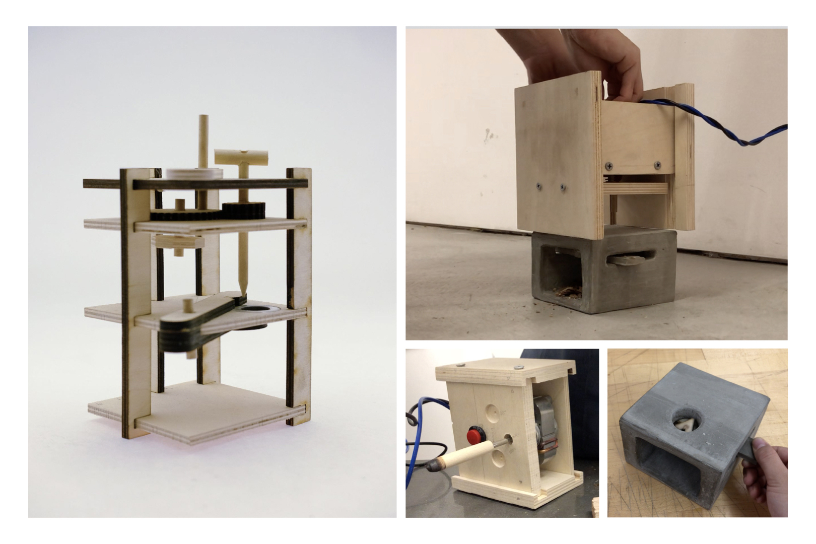
My initial plan was to make a physical machine, which was abandoned due to limited time and resources. Two prototypes were made to figure out the mechanism. The material palette and form were not aesthetics-led choices but for easy production.
